This week, I had the pleasure of immersing myself into two pieces of digital storytelling – Snow Fall: The Avalanches at Tunnel Creek by John Branch of the New York Times and Welcome to Pine Point by The Goggles (aka Michael Simons and Paul Shoebridge).
Similarities
The two stories both incorporate various forms of media to tell a story, the user themself has to click from page to page and therefore it creates an immersive experience, and the stories themselves are both extremely personal narratives. Additionally, the stories aim to tear at the heartstrings of the audience and evoke emotion while they are interacting with the videos, audio, and photos.
Differences
Snow Fall focuses on a specific event that took place on just one day while Pine Point reflects on the years it took to build, sustain and eventually tear down a town. Snow Fall is told by the perspective of a typical journalism story with anecdotes, facts, and pieces of perspective with those involved in the avalanche, whereas Pine Point is an informal type of documentation. Snow Fall is also on a specific timeline and the events go in chronological order, while Pine Point is somewhat of a “Choose Your Own Adventure.”
One of the elements that I particularly enjoyed when reading Snow Fall was the interactive map of the mountain that the author included. The text was off to the left side accounting the specific events while on the right there was an interactive display showing you the path that the skiers and snowboarders took both before and after the avalanche. Screenshots of those maps are provided in a slideshow below to show the progression.

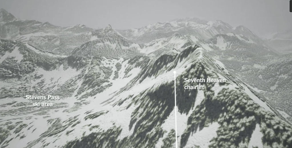
When it came to Welcome to Pine Point, I found the story to be much more user friendly and could see all that I wanted was clear and at my fingertips.
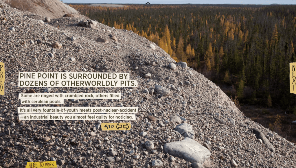
As you can see from this still shot, you have icons on the left and right of the screen to either go forward or back, icons in the middle of the screen to comb through a number of different photos of the pits being referenced on the page, and then in the bottom left corner you can click on “Here To Work” to toggle between different chapters of the story.
In my opinion, Pine Point perfectly executes upon Andrew DeVigal’s idea of the personalized and crafted experience. In Anna Li’s Poynter article, a line jumped out that I feel Simons and Shoebridge executed well with their project: “DeVigal wants to make viewers feel as if the story was about themselves.” These two men crafted an experience that is applicable to a large chunk of people who grew up in towns that were seemingly built for just the nuts and bolts of one’s needs and not much else. If anything, there is so much user interactivity that is incorporated that it can be somewhat hectic.
Snow Fall seems to be much more calculated with each specific detail being included with specific intent. In a Q & A with the team that crafted this piece of media, Catherine Spangler, a video journalist that worked on the project, said as much. “We focused on the pacing, narrative tension and story arc – all while ensuring that each element gave the user a different experience of the story.” This lebel of intent is palpable and really enhances the reader’s journey.
Even though both of these projects were created in the early 2010s, they could easily be made exactly the same way today. The biggest challenge would be the vast amount of resources available now in that they could stray away from the story itself in the name of user interaction. Sometimes the more simplistic an animation or a map is actually for the better, as you would want to keep the focus on the content itself, not the technology available.
 Jack Bennett's Mets Blog
Leave a comment